
5 Minute Brand Code Health Check
- Holleigh Stevenson
- Nov 4, 2024
- 2 min read

Let's start at the very beginning - What is a brand code?
Also known as Distinctive Assets, Fluent Devices, Key Brand Assets!
Whatever you call them, they are the look and feel of your brand. They are the memory structures you place in the minds of your consumer, that they can recall at any time and think of you.
So how do you use brand codes?
The more you try to communicate, the less it will land. A good rule of thumb is to stick to 3-5 brand codes and do them wholeheartedly, at every touchpoint and throughout the whole business, from office to shop floor.
Let's take a deep dive into different types of brand codes, who is doing it well and how you can learn from them:
First up on our brand code list is: Colour Palette.
Is it choiceful? Do you own a colour in your market? Or a set of colours that scream your brand?
Big brands getting it right:
KitKat's 1795c Red Pantone.
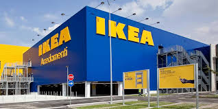
Ikea's 2145c Blue & 108c Yellow.
Cadbury's 2685c Purple - trademarked!
Independent brands show you don't need a big budget to get it right:
Pillars Brewery own their orange, it is through their logo, their packaging, their website and their merch!
Loaf Mcr own pink. Pink Pink everywhere. And they have been brave enough to never get bored of it.
Moth Drinks utilises Black as their signature brand code and it provides the perfect backdrop for their website, socials and live event stands.


Next up we have Typeface - does it represent you well and is it consistent throughout your brand? My favourite example of getting this wrong is when a nursery or school send a letter to parents in Comic Sans. This is not understanding your audience, as a parent I want to read a letter that's written to me, not my child.
Big brand getting it right:
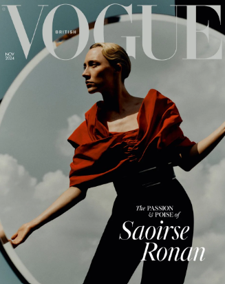
Vogue Didot, if you see the V alone I bet you would know where it came from.
Indie Doing it right:
MOJU aren't afraid to repeat themselves! A quick look at their product and website shows they trust their typeface has an impact because it is everywhere. It also represents exactly what the product does!


Slogan - can be hard to get right but can be a super easy way to tell your consumer a quick story! These should create a response in the customer.
Brand brand getting it right - the list is endless:
Nike - Just do it.
Snickers - You're not you when you're hungry.
Tesco - Every Little Helps.
Smaller brands doing it right:
Tony's Chocolonely - Crazy about Chocolate, Serious about People.
AKT - Natural Deodorant that performs!
Other examples of brand codes:
🐓 Characters - think Minor Figures, Mailchimp, Duracell Bunny.
✅ Logo - think Nike, Tiny Rebel, Gymshark.
🛍️ Packaging - think Selfridges yellow bag, Campbells Soup, Pringles.
If you don't have 3 - 5 of these... What can you do to add or if you have too many, how can you pull back? And then plaster these everywhere. Be strict and make them clear at all touchpoints.
If you need help with tightening up your branding why not give me a quick message and we can have a chat about how I could help!


Comments